 FAITH_001
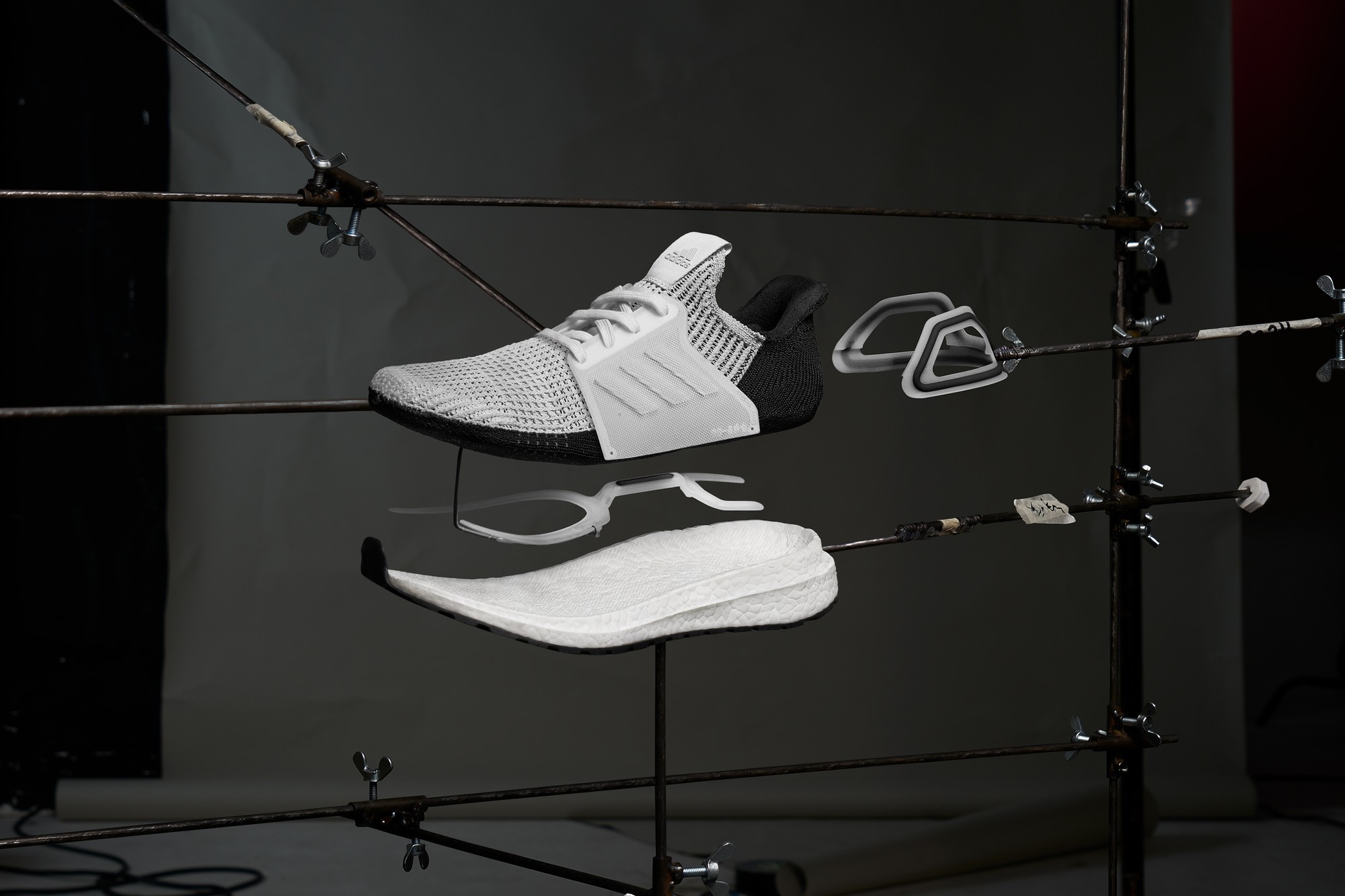 ADIDAS_UB19_002
 ADIDAS_UB19_003
 ADIDAS_ORIGINALS_UNHEARD_001
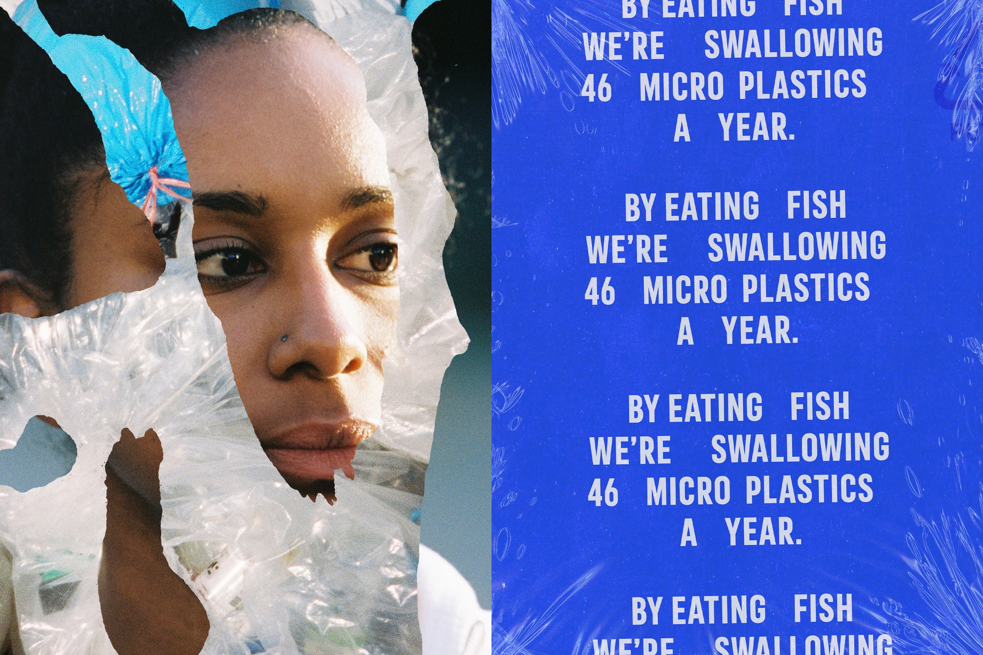
 WHALE_001
 ZALANDO_NIKE_001
 FAITH_002
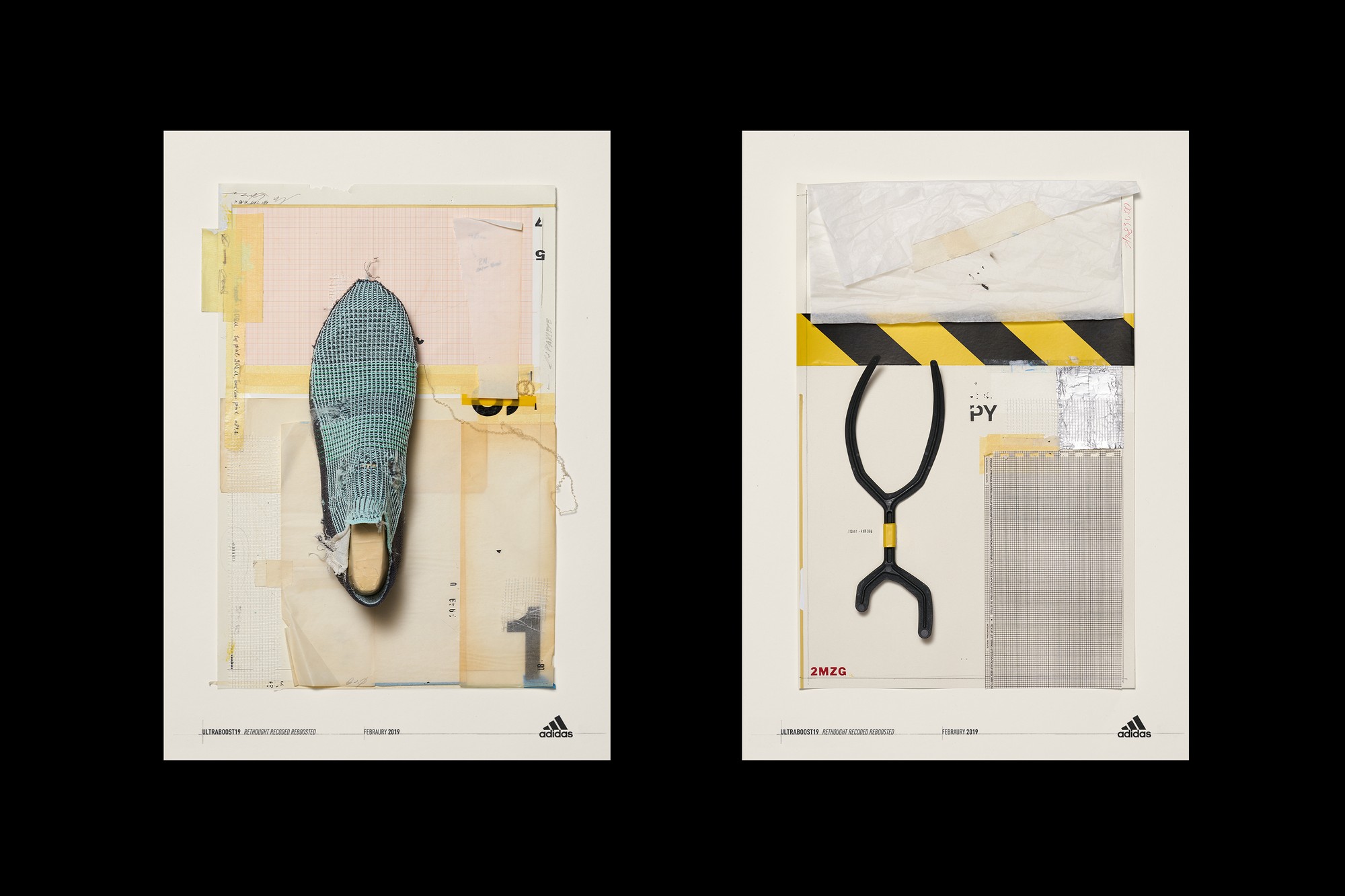
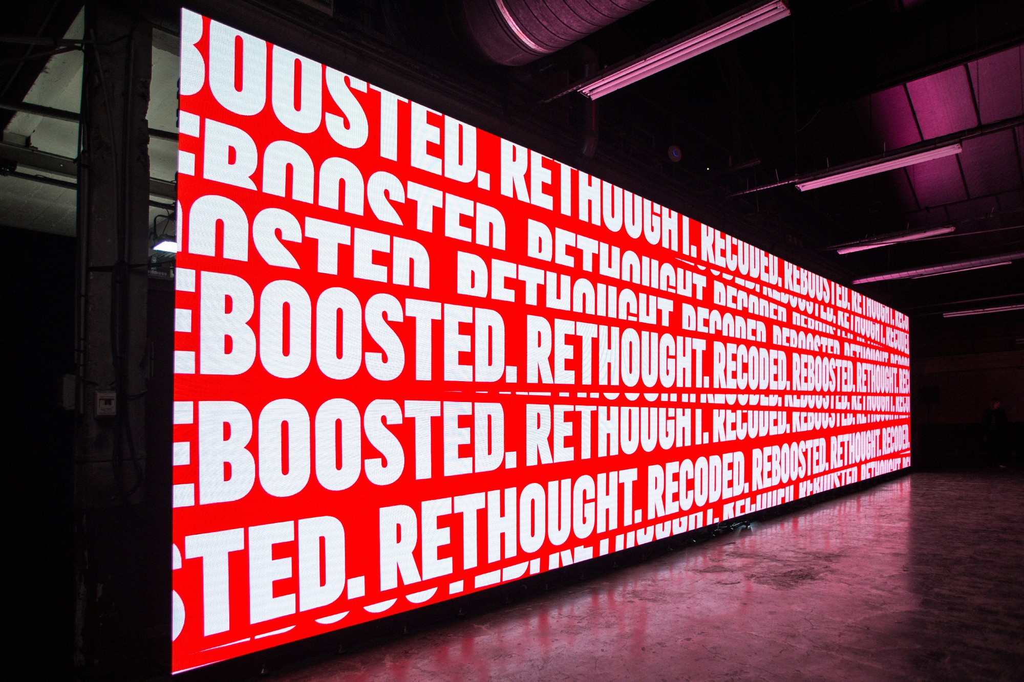
 ADIDAS_UB19_LR_001
 ADIDAS_ORIGINALS_UNHEARD_002
 CHIVAS_IRWR_004
 FAITH_003
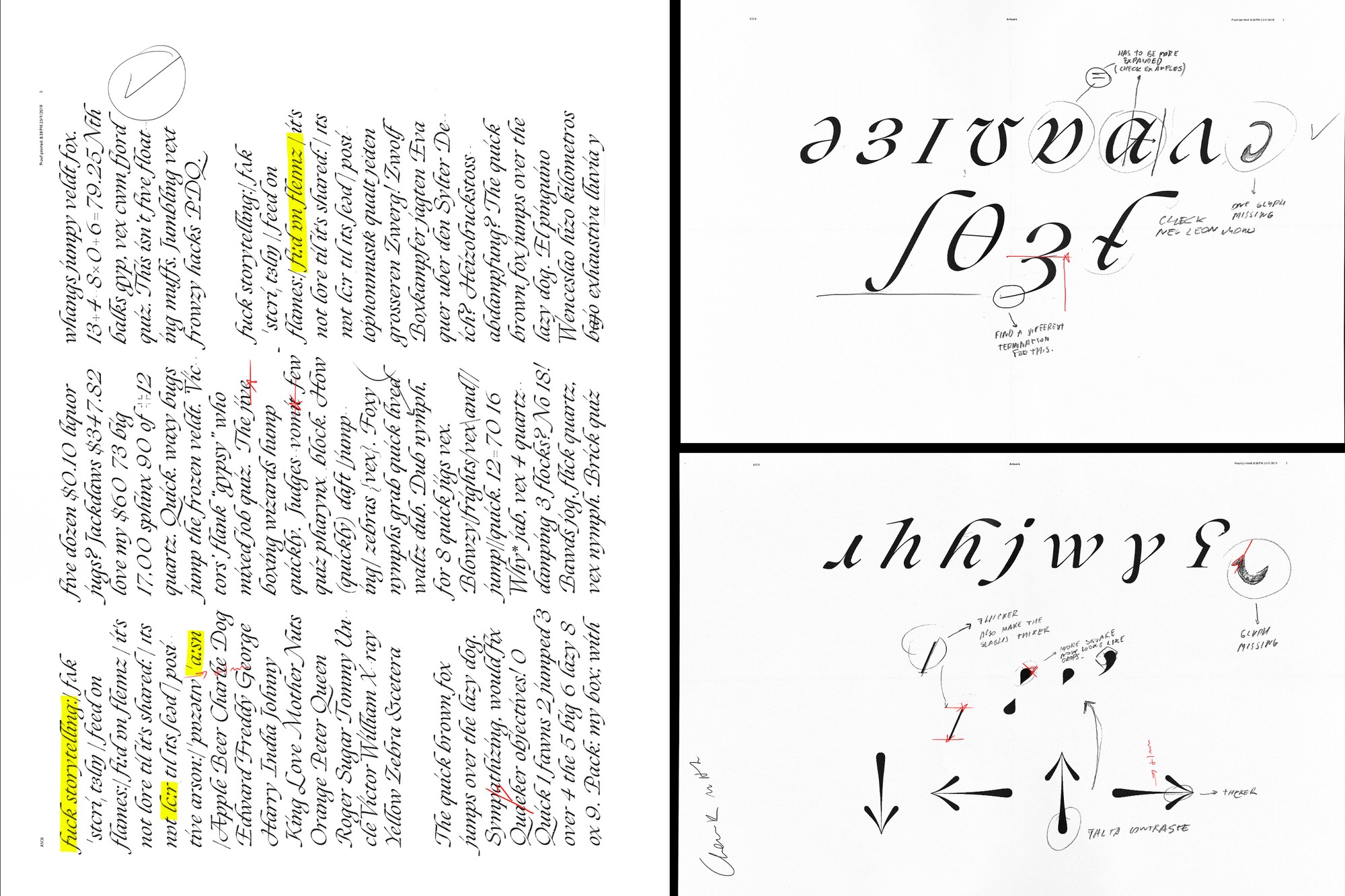
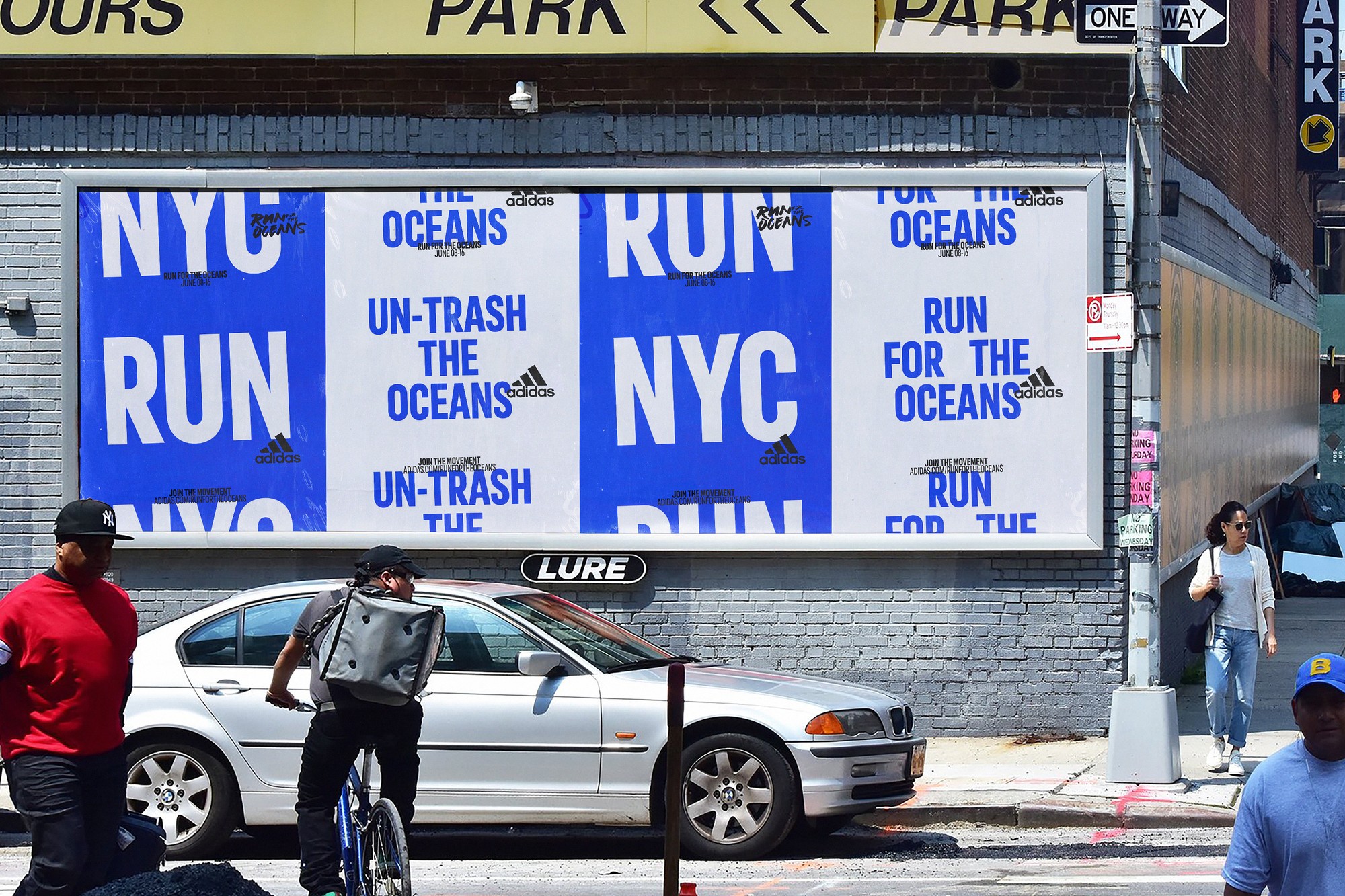 RFTO19_001
 FONSO_DDT_001
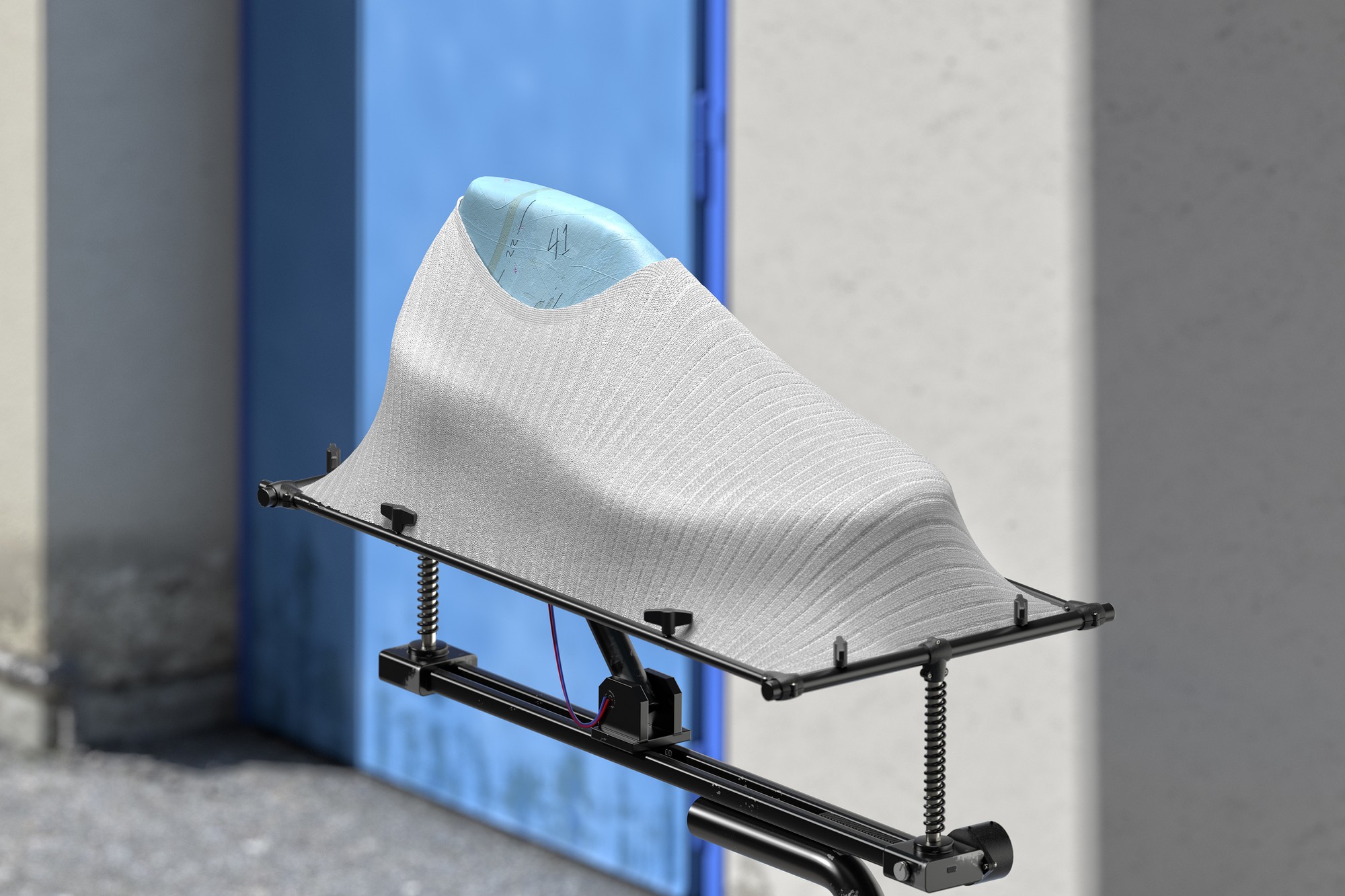
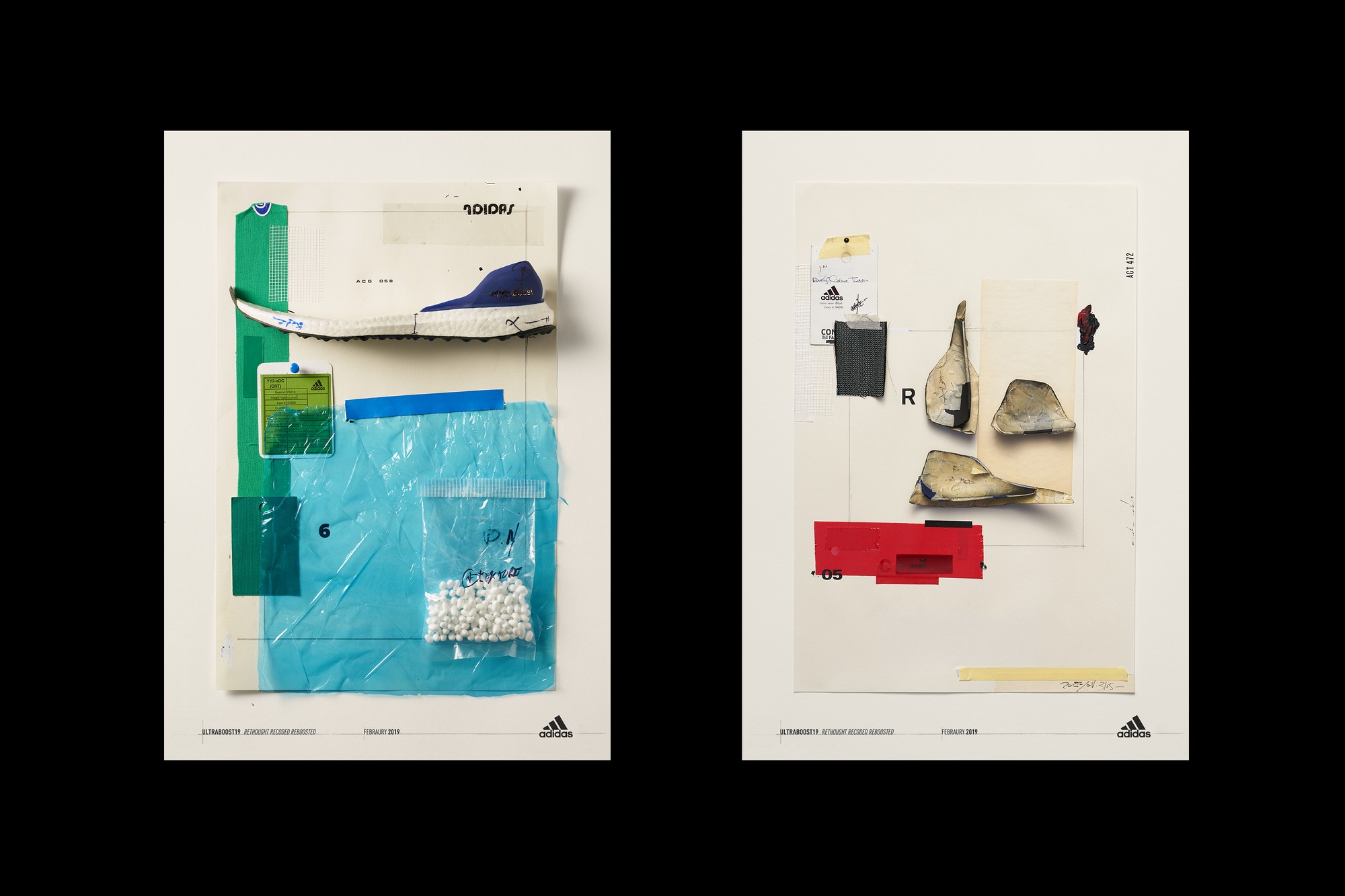 ADIDAS_UB19_005
 ADIDAS_UB19_LR_002
 STUDIOLORE_001
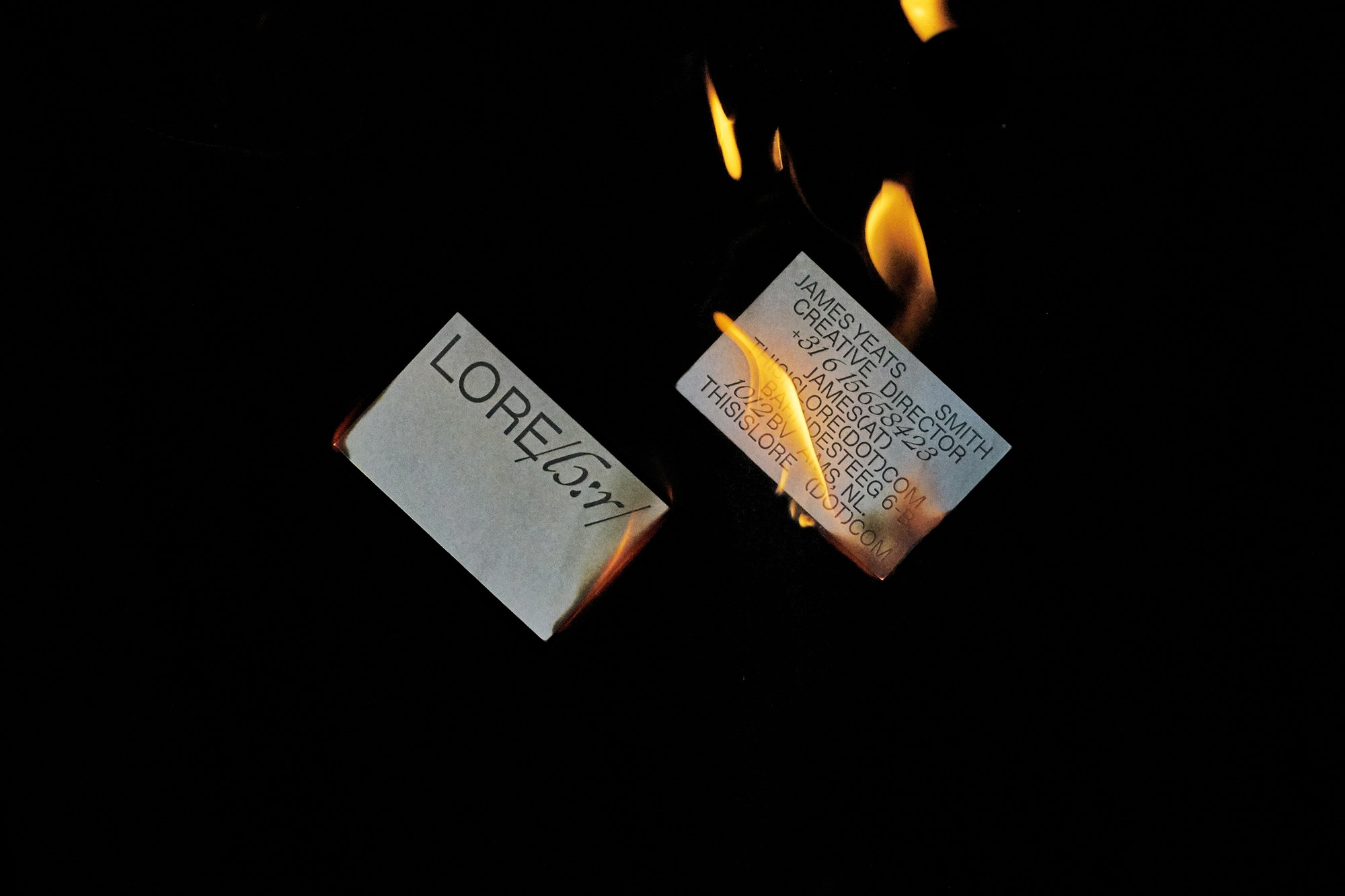 STUDIOLORE_002
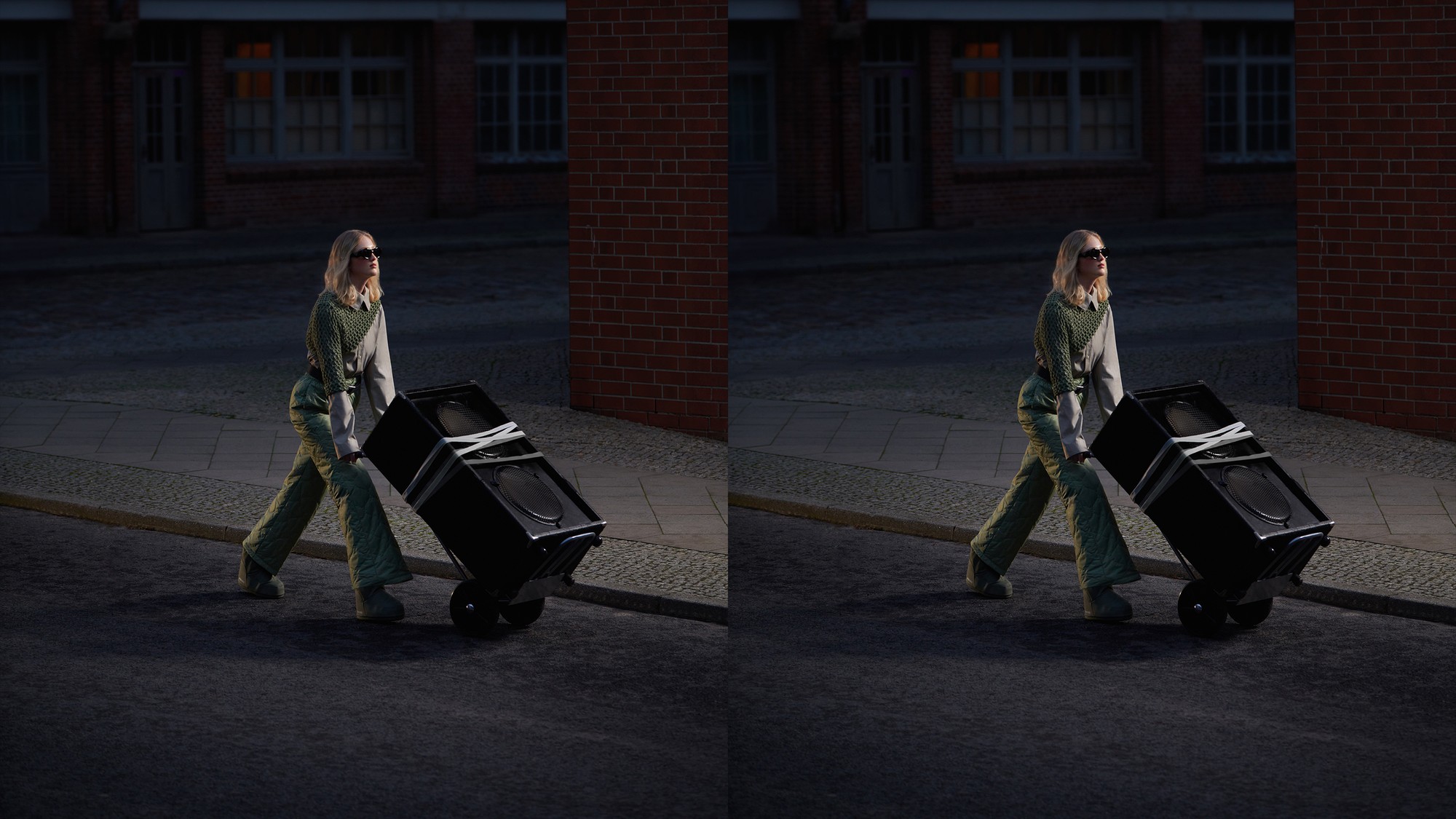 ZALANDO_NIKE_002
ADIDAS_ORIGINALS_UNHEARD_003
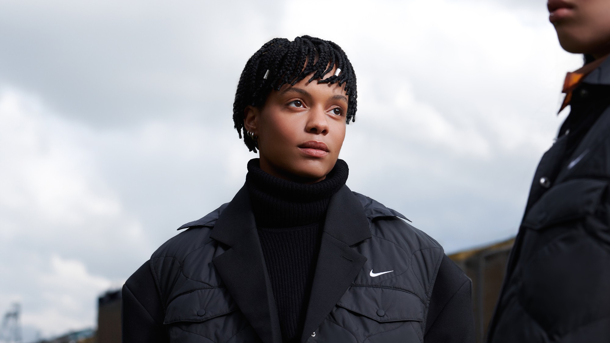 ZALANDO_NIKE_003
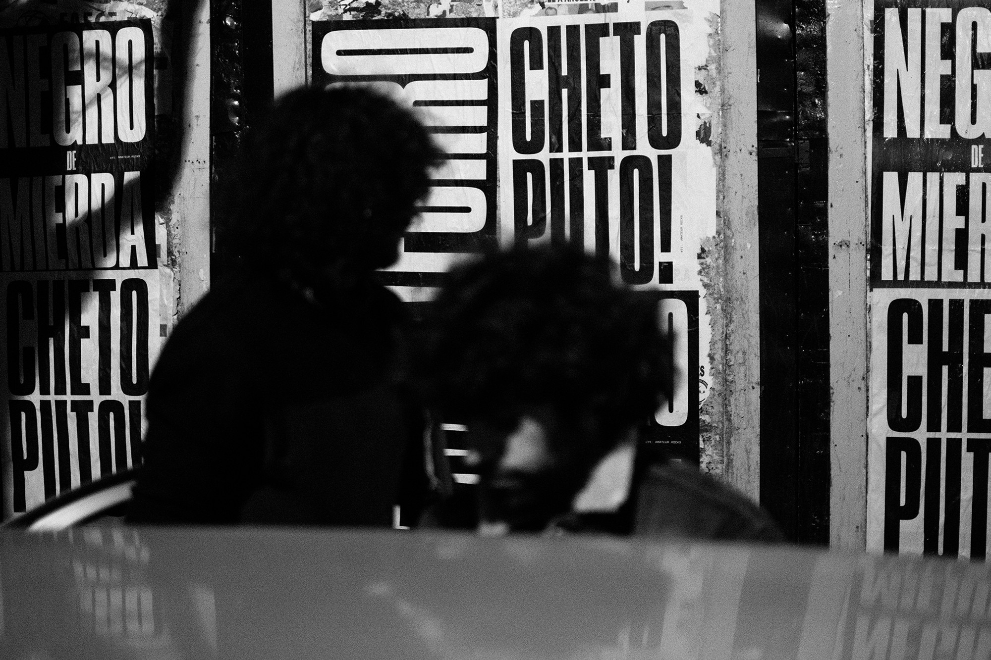 BOCASSUCIAS_001
 FONSO_WEDDING_001
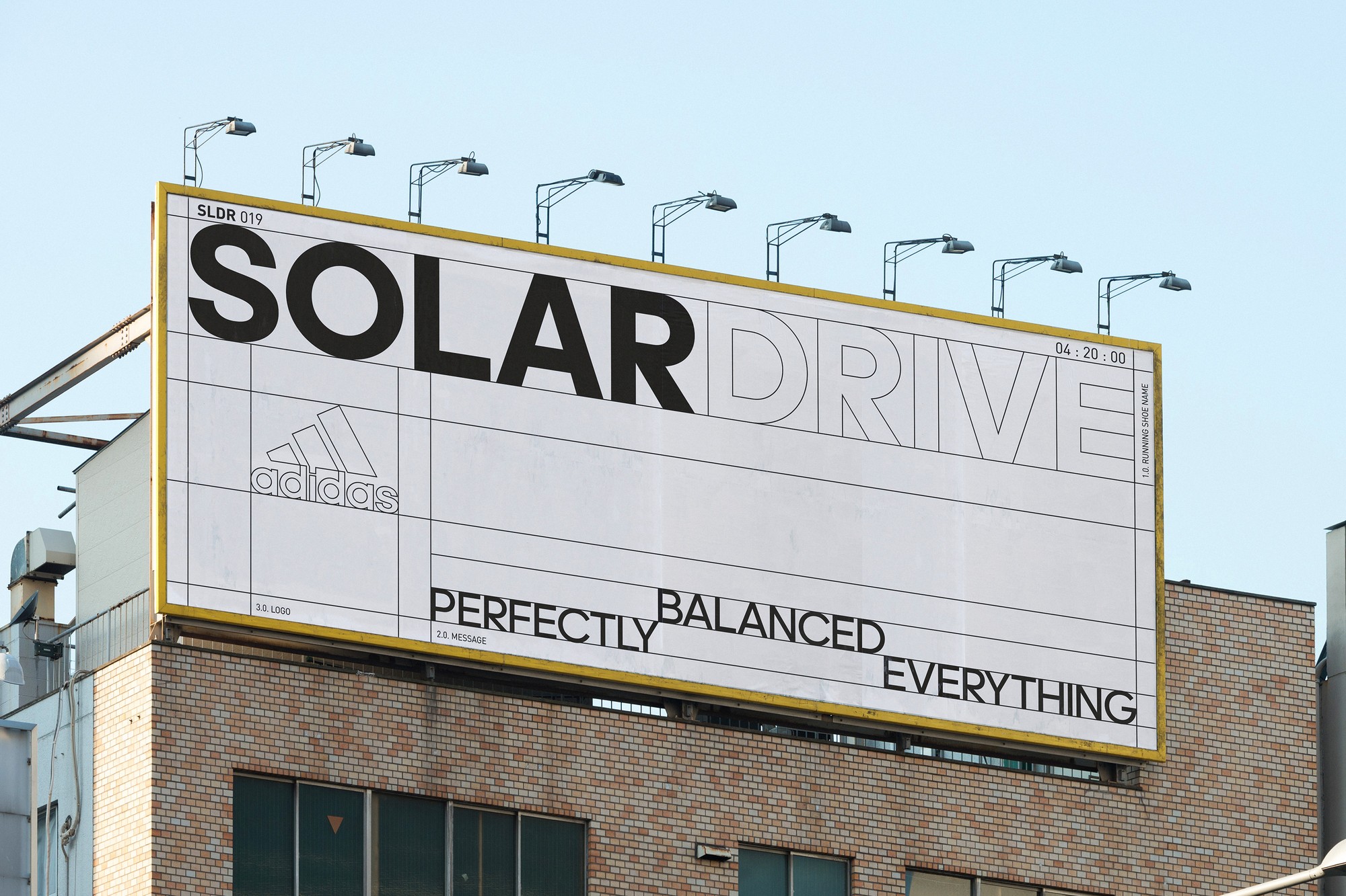 ADIDAS_SOLARDRIVE_002
 STUDIOLORE_003
 ADIDAS_SOLARDRIVE_003
 RFTO19_002
 WINONA_INTL_001


